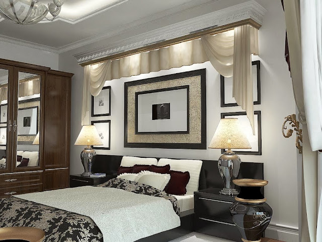
1. Furniture. Having too much or not enough. Most of the time it's too many pieces. To avoid the
mistake of having the furniture not fit, measure the room first. You would be amazed at how many
people DO NOT do this simple task!!
2. Color Scheme. Often it's a lack of color. Or they add color, but it's in one area only. For example;
yellow pillows on the sofa and but no where else. Notice how you eyes linger on those yellow
pillows?
3. Wall Art. Most of the time, people hang wall art too high. Good rule of thumb, 60" from floor to center of the picture. With an exception of wall art hanging over the sofa, then it's 8" off the sofa.
4. Clutter. Nothing ruins a good design faster then clutter. Less is more!!
5. Lighting. Here's a formula you can follow, when deciding if you have enough light in a room.
Multiply length x width of the room, then multiply 1.5 = wattage. For Kitchen, multiply 2.5
instead of 1.5 for wattage. Don't forget about ambient lighting.
6. Focal Point. Each room should have a focal point. In the bedroom, it's the bed. In today's home,
the TV seems to be the focal point. Group your furniture around the focal point, and if necessary,
use an area rug to ground the space.
7. Matchy-Matchy. A look that is outdated and boring!! Add piazza and character to your room by
designing a room that co-ordinates rather then match.
8. Accessories. Don't line your accessories in a row. Instead, group them in odd numbers, 3 being the perfect number. You can add in different height, texture and color (all blue but different shades of blue). Don't forget about scale.
These tips should guide you in achieving the room you desire. If you would like your room to be filled with happiness every time you walk in, contact us!
#ABELLAHOMESTAGING


No comments:
Post a Comment